A new virus is ravaging the world. It has arrived in the United States and data is pouring in, but it's too much data to analyze. We need someone who can help us process the data and put it into an easy-to-understand visualization! Has anyone taken a programming course?
In this lab, you will process flu cases during the 2018-2019 season, and create a state heatmap showing where the flu hit the hardest on a week-by-week basis. You will harness your skills with files, Lists, loops, and now Dictionaries.
Download the CSV file WHO_NREVSS_Clinical_Labs.csv containing flu data for 2018-2019. You can find this and many other interesting data files from the CDC portal.
Install our USA mapping library!
pip3 install --upgrade setuptools
pip3 install plotlyCreate a file part1-states.py
This step is like a HW assignment. You will write a short program to let the user query state abbreviations. I provide you a text file of state names and their postal abbreviations. Your program output should EXACTLY match this:
State: Maryland         # Remember, red is user input
MD
State: California
CA
State: Pennsylvania
PA
State: exit
Goodbye!
As you write your solution, you must include the following:
Define and use a function called create_state_dict(filename) which takes a string filename as an argument, and it returns a Dictionary. The Dictionary maps state names to state abbreviations. The keys are states ('Alabama') and the values are postal abbreviations ('AL').
You should not open the states.tsv file anywhere in your program except inside create_state_dict(filename)
Just to make sure you did the above 2 points correctly, this line of code should be in your program:
# Create state->abbreviation lookup dictionary.
stateIDs = create_state_dict('states.tsv')Create a file part2-counts.py
This step is a separate program that reads the Flu Data CSV file. Open it and look at the data. There is quite a bit of it ... it starts on Week 40 of 2018 (end of September) and goes through Week 39 of 2019. A typical flu season starts in the Fall, hence the September starting date.
The columns we care about are 'TOTAL A' and 'TOTAL B'. These are the two counts of confirmed flu viruses for a particular location/week. Your program will read in the CSV file, and print out just the TOTAL A (for now) for each state for a specific week. You'll need to do 3 things to accomplish that:
Open and loop over the lines in the CSV file.
Convert each line to a Dictionary, where the keys are the column names, and the values are the row's contents. You must write a function for this called make_dict_from_line(keys, line)
After converting to a Dictionary, check if the row matches our target week and print its flu count.
Write a function make_dict_from_line(keys, line) that takes a line as an argument, as well as the column names from the CSV file, and it returns a Dictionary of the line.
You will hardcode the column names in your program. Just make a List variable:
keys = [ 'REGION TYPE', 'REGION', 'YEAR', 'WEEK', 'TOTAL SPECIMENS', 'TOTAL A', 'TOTAL B', 'PERCENT POSITIVE', 'PERCENT A', 'PERCENT B' ]keys = [ 'REGION TYPE', 'REGION', 'YEAR', 'WEEK', 'TOTAL SPECIMENS', 'TOTAL A', 'TOTAL B', 'PERCENT POSITIVE', 'PERCENT A', 'PERCENT B' ]
line = "States,New Mexico,2019,13,521,52,2,10.36,9.98,0.38"
d = makedict_from_line(keys, line)
print(d)
Use this code above for testing!! Write your function and see if the code works before moving on to opening and reading the actual CSV file. Your dictionary should print something like this:
{'TOTAL A': ' 52', 'PERCENT A': ' 9.98', 'PERCENT POSITIVE': ' 10.36', 'TOTAL SPECIMENS': ' 521', 'PERCENT B': ' 0.38', 'WEEK': ' 13', 'REGION': '\tNew Mexico', 'TOTAL B': ' 2', 'YEAR': ' 2019', 'REGION TYPE': 'States'}If you wrote the above function correctly, you are ready to complete your program. Ask the user for a Week and Year. Your program should then open the CSV file, and print out all states and their flu counts (prints Total A).
Week: 10          # red is user input
Year: 2019
Alabama 125
Alaska X
Arizona 50
Arkansas 361
California 179
Colorado 381
Connecticut 143
Delaware 115
District of Columbia X
Florida X
Georgia 124
Copy part2-counts.py to part3-counts.py
Combine Step 1 with Step 2 so that your output uses the State IDs. You better bring over that helpful function create_state_dict! Here's the required output:
Week: 10          # red is user input
Year: 2019
AL 125
AK X
AZ 50
AR 361
CA 179
CO 381
CT 143
DE 115
DC X
FL X
GA 124
Copy part3-counts.py to part4-fluviz.py
Pause and consider your output from Part 3. You filtered the big CSV file down into just states and flu counts. That should be all you need to visualize a map as long as you can find an easy-to-use Python mapping library! If you were on your own, you could search Google for "python map of usa" and see what comes up. That's what we're using here!
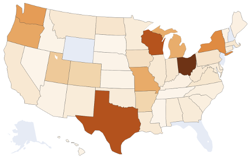
The plotly library of Choropleth Maps is an awesome library. It even has maps at the county level in the US (scroll down that link and see!). We will use the basic US States map. It's easy to use: put this in an empty file (call it test.py) and run it:
import plotly.express as px
from plotly.colors import sequential as colors

# Create the map object.
fig = px.choropleth(locationmode="USA-states", scope="usa", color_continuous_scale=colors.Oranges,
    locations=["CA","TX","NY"], color=[16,8,28])
# Show the map in a web browser.
fig.write_html('youroutput.html')
The last line produces an HTML file for you. Open it up in Windows. See the 3 colored states? Now study the actual code you just ran. See why and how those 3 states were colored?
Your Task: Modify your Part 3 to generate a map of the USA with its flu counts. Requirements:
Generate map trends. Watch the flu spread! Give the user flexibility to enter a range that they'd like to view:
Start: 46 2018
End: 10 2019
Your program should then generate a series of maps (save as separate HTML files with week/year names). In this example above, your first map is of week 46 in 2018, followed by week 47, then 48, all the way to week 52 in 2018 ... which should then roll over to week 1 of 2019 and continue through week 10 of 2019.
Your solution should rely on a function generate_map(week,year) with perhaps other arguments ... but the function should save one HTML file out when called.
Obviously, all valid inputs should be allowed, including just viewing a single week:
Start: 10 2019
End: 10 2019Visit the submit website and upload your 4 files: part1-states.py, part2-counts.py, part3-counts.py, part4-fluviz.py